Imagining someone without a name, personality, or distinct behavior is difficult. It is human nature to assign certain identifying characteristics to a person or thing and call it their identity. Therefore, every human creation has its own identity, unique or not.
The situation is similar with companies.
Companies are given names, personalities, and even humanized so that the target audience can identify them, relate to them, and differentiate them in the marketplace. This unique identity of a company is the corporate identity.
But what is corporate identity, what are the elements of corporate identity and why is it important for a company?
Definition
Corporate identity is the way a company presents itself to the public (including internal and external target groups). It’s how the company looks, behaves and communicates.
It helps the company to be recognized and distinguished in the market and among its internal stakeholders (including all employees, investors and partners of the company) and external stakeholders (including customers, consumers, media, etc.).
Components
Corporate identity as a strategy of corporate management consists of 5 to 7 areas and sub-areas, depending on the design. To develop a coherent strategy, you should analyze each area to see how it impacts your corporate identity. Clearly understandable basic values are the basis for a comprehensive concept. A company motto also succinctly summarizes these values. Develop an effective strategy by soliciting feedback from all departments and making the process transparent. The literature recommends evaluating the success of a strategy according to these four factors:
- Differentiation
- Reputation
- Relevance
- Coherence
A company motto should be short and meaningful, so it is important to choose it wisely. One example: For years, Google’s corporate motto was “Don’t be evil.” This motto is in some ways a great principle that conveys corporate social responsibility, however, much of the message consists of a denial (“do not”) of a condition: you run the company well by simply remaining passive and not doing anything “bad.” In 2016, Alphabet, the new umbrella company that owns Google, introduced a new motto: “do the right thing.” This statement is similar in structure, but now calls for positive action instead. This conveys more dynamism and encourages employees to take responsibility for their own actions.
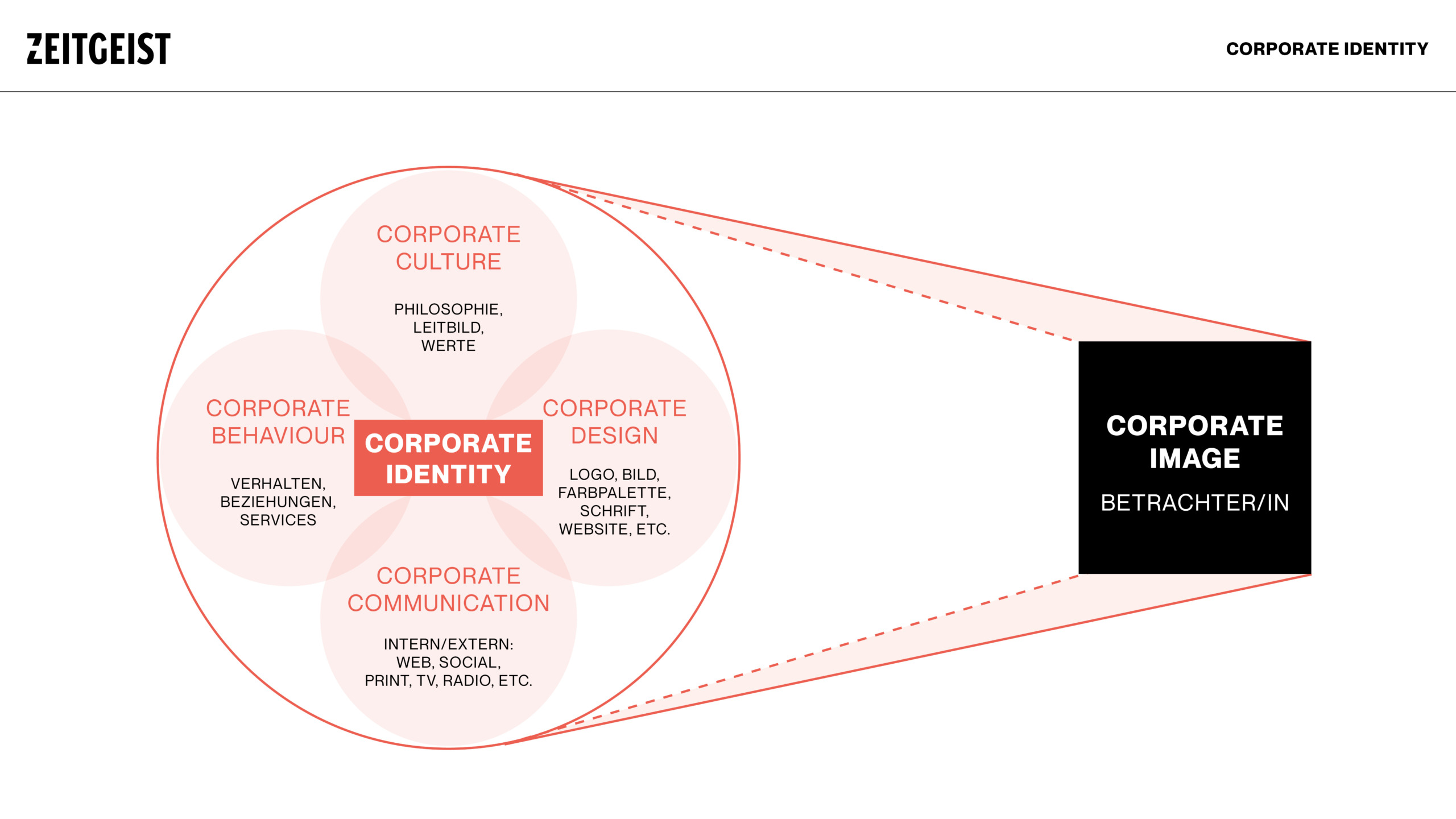
The main areas of corporate identity are:
- Corporate Design (CD)
- Corporate Behavior (CB)
- Corporate Culture
- Corporate Communication (CC) + Language (CL)
Corporate Design
Corporate identity is often equated with corporate design. In reality, however, this is only one aspect of corporate identity – namely the visual appearance of the company.
Thus, corporate design is the most immediately visible part of corporate identity. Elements of corporate design include the company logo, the company’s visual presence at trade shows, the design of the company website, and the distinctive design features of the company’s products and packaging.
Corporate Behaviour
The importance of a company’s behavior in terms of its impact on corporate identity should never be underestimated. This also includes a company’s behavior toward all those who could be called stakeholders. In addition to external behavior toward customers, the media and the public, corporate behavior can also be shaped by internal concerns. These include, for example, fair treatment of employees and the behavior and leadership style of management. A company’s employees can also have a major impact on corporate behavior through the values they choose.
Corporate Culture
A consistent language and communication style are also important components of a corporate identity. Corporate communication concerns both common commercial activities, such as press releases and advertising slogans, and all the various activities that could be called internal communication, including communication with and between employees, the employee magazine, etc.
Corporate Communication & Language
Companies use a certain language to express their corporate culture. This language can be formal and structured or informal, e.g. in a company with flat hierarchies. Communication deals with the way a company expresses its concerns and values internally and externally. This includes communication between the individual departments and hierarchical levels in the company, as well as public relations and advertising campaigns.
Examples
Below are a few examples of corporate identities from large established brands. The important thing to understand here is that these have evolved over the years. Just as a person develops over the years, so do brands.
Apple
Apple’s exclusivity formula is the key element of the company’s corporate identity. Apple’s slogan “think different” underscores this formula. It ensures that it sends the same corporate message with all its offerings.
This sets the company apart from other market players.
Aside from that, Apple is also committed to the community, including offering educational programs to more than 3.6 million suppliers since 2008. This helps Apple maintain its strong corporate identity through the proper use of corporate identity elements.

Starbucks
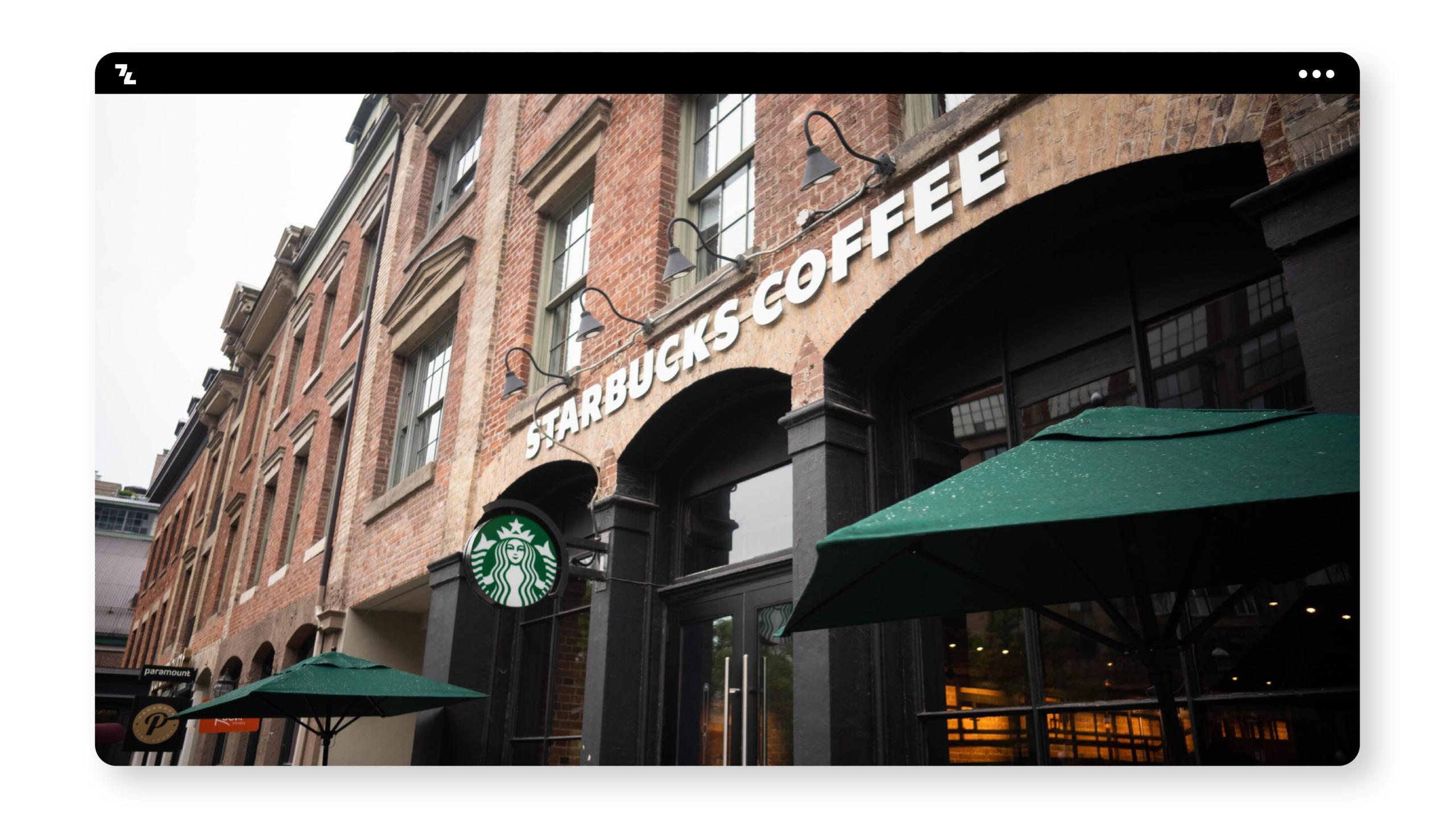
Starbucks’ high-quality, premium and tasty coffee is known all over the world. But that’s not the only thing that makes the company famous. It is the consistent atmosphere it creates in its stores, the consistent corporate promise and the consistent brand design that makes it more trustworthy and reputable.
Starbucks also takes its social responsibility very seriously. Among other things, Starbucks helps farmers and gives jobs to refugees.
In this way, Starbucks has become one of the most relevant coffee house chains in the world
Airbnb
As with many tech startups (e.g., Google, Amazon, and Apple), Airbnb’s business model has evolved over the years to allow the brand to enter new markets. In this case, Airbnb transformed itself from an advertising site to a major player in the competitive travel industry and, more recently, an innovator in the experience economy.
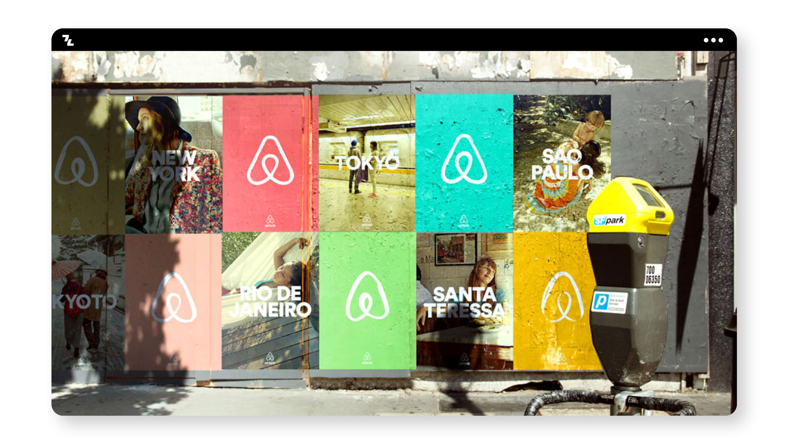
This brand evolution was accompanied by an ever-changing visual identity for the company – most notably the 2014 rebranding. To give its growing community of travel-loving hosts and bookers a new brand image, Airbnb partnered with DesignStudio to completely transform the company’s previous visual identity.
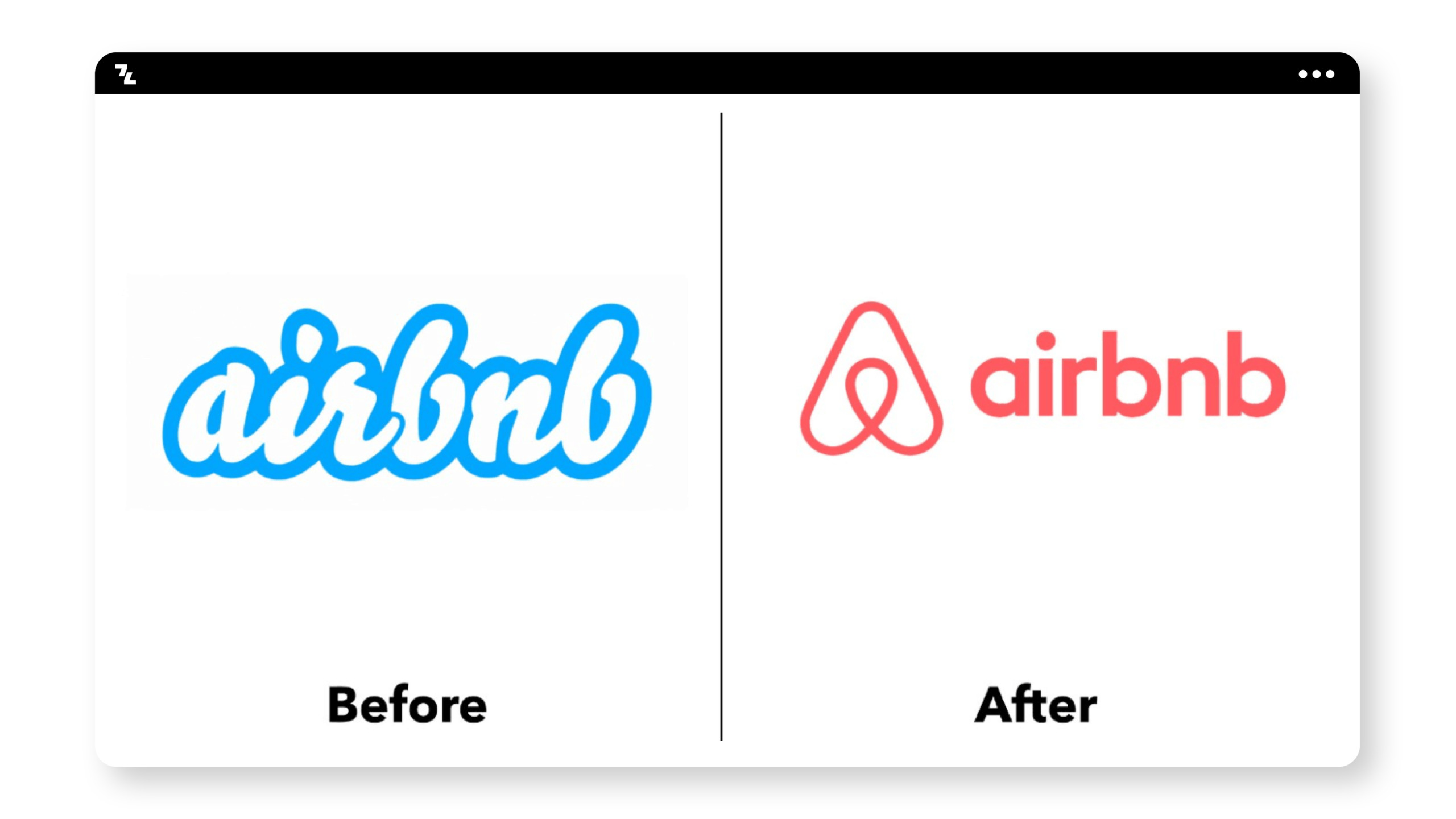
The result was Airbnb’s famous “belong anywhere” slogan, powerfully visualized through a brand new logo design. The revamped logo was a perfect fit for the new brand positioning, with a universal ‘A’ to transcend language barriers and symbolize a united community.
Along with a more versatile color palette and a set of illustrative, universally recognizable icons, Airbnb’s corporate identity immediately became more modern, international and accessible.
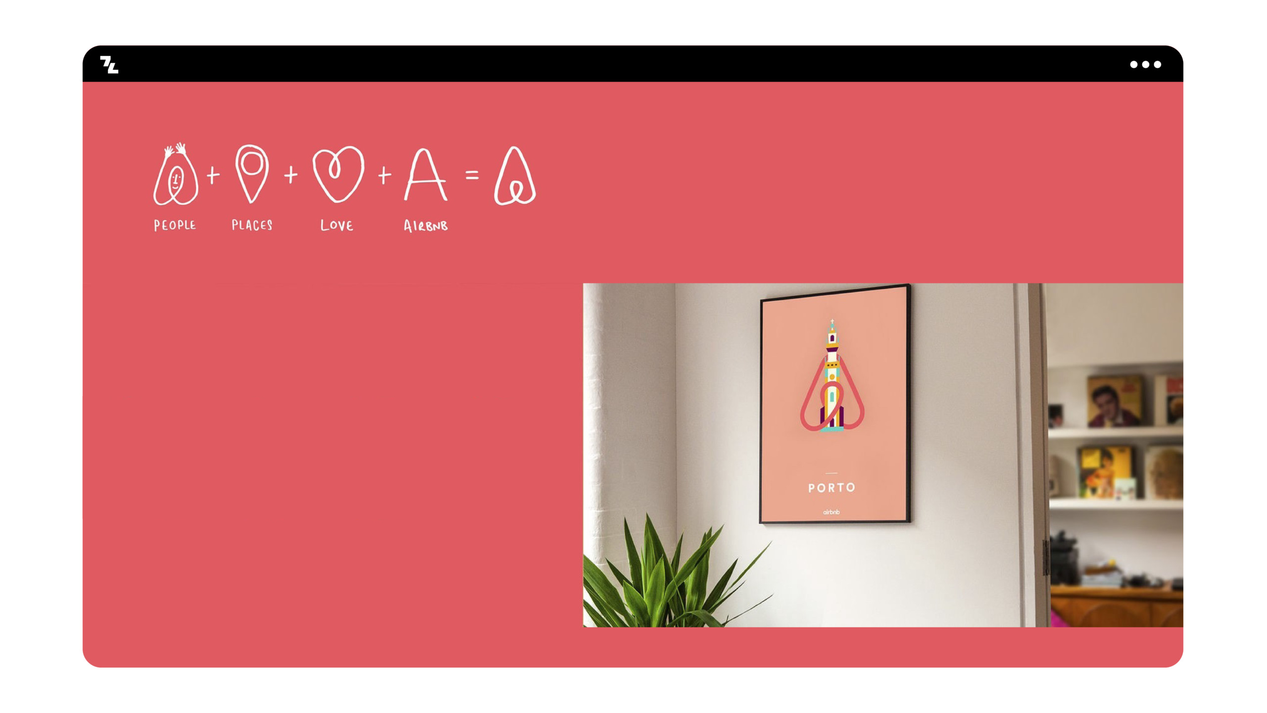
Since 2014, Airbnb has continuously evolved its corporate identity, adapting the original rebranding to changing platforms and communication channels. Today, Airbnb offers not only bookings but also experiences, and marketing content ranges from a print magazine to social media channels. In a recent blog post, Airbnb acknowledged the importance of its visual identity, stating that “design principles still guide us every day.”
This is most evident in the expansion of the illustrative route from 2014, as well as the human-led photography style. Each enhancement or iteration of the strong corporate identity builds on Airbnb’s warm, engaging, fun, and welcoming brand image.
Australia Open
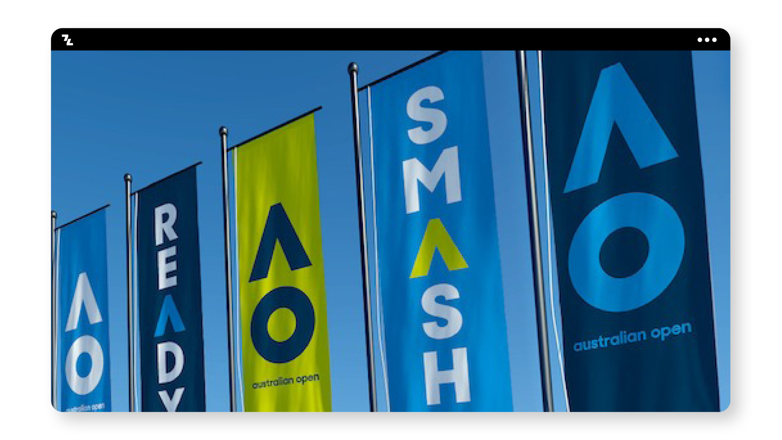
The Australian Open underwent a rebranding in 2016 by the Landor Australia agency. They took an outdated logo and completely overhauled the look. They eliminated any visual reference to tennis players or tennis balls and simplified the brand to “AO.” They simplified it even more by removing the crossbar from the A. Then they applied this “circle and delta shapes” motif to all the other brandings. The result is a branding system that is bold, sporty and fun. They eliminated all the stuffiness that the previous logo had.
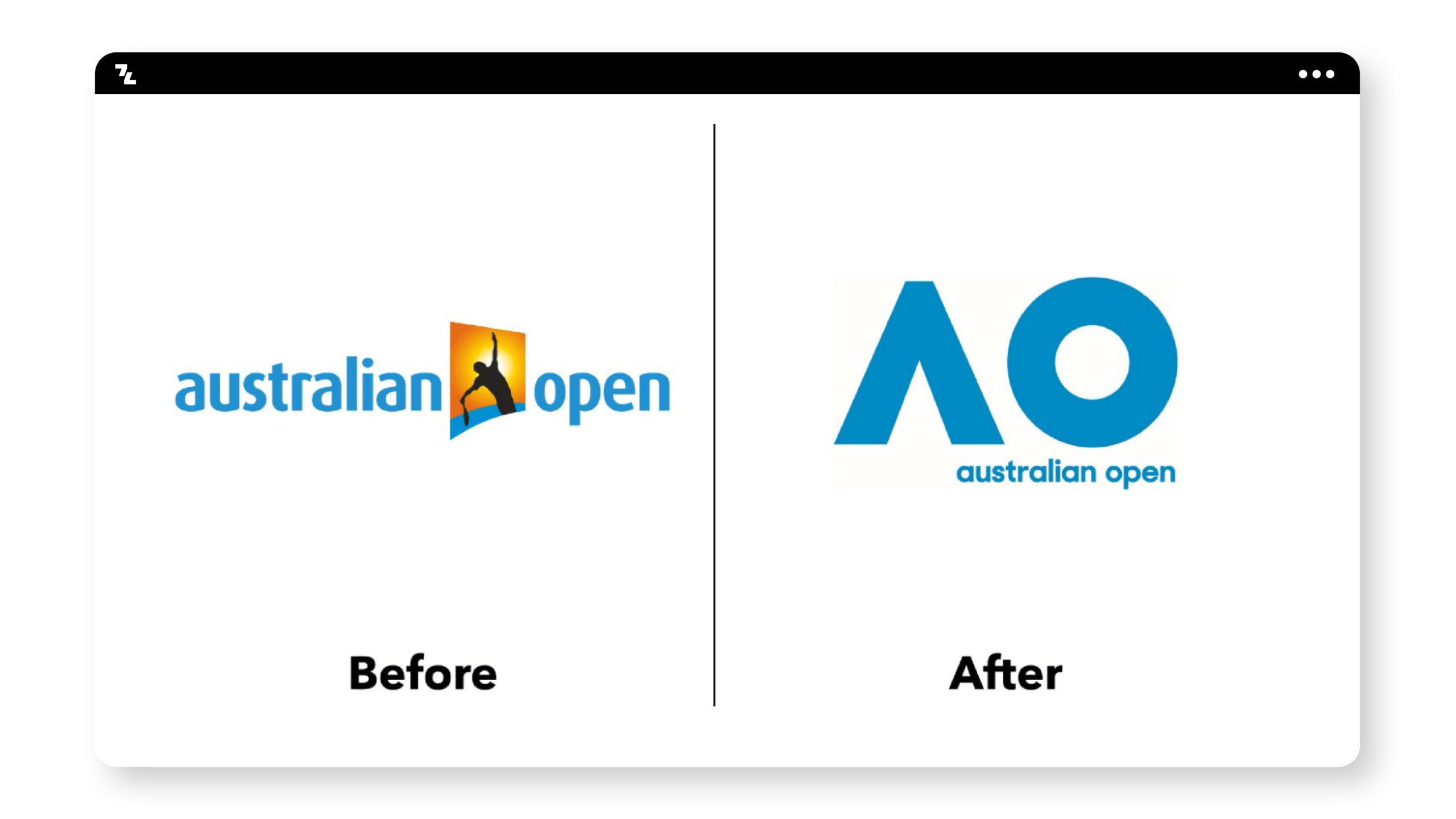
Sometimes a logo needs to be completely rethought. If the current logo doesn’t fit the client’s goals and values, it needs to change. Also, don’t be afraid to break a brand system down to simple, essential elements.
Zendesk
Zendesk is help desk software that helps businesses everywhere provide fast solutions to their customers. The original logo was a happy Buddha (hence the “Zen”) wearing a headset.
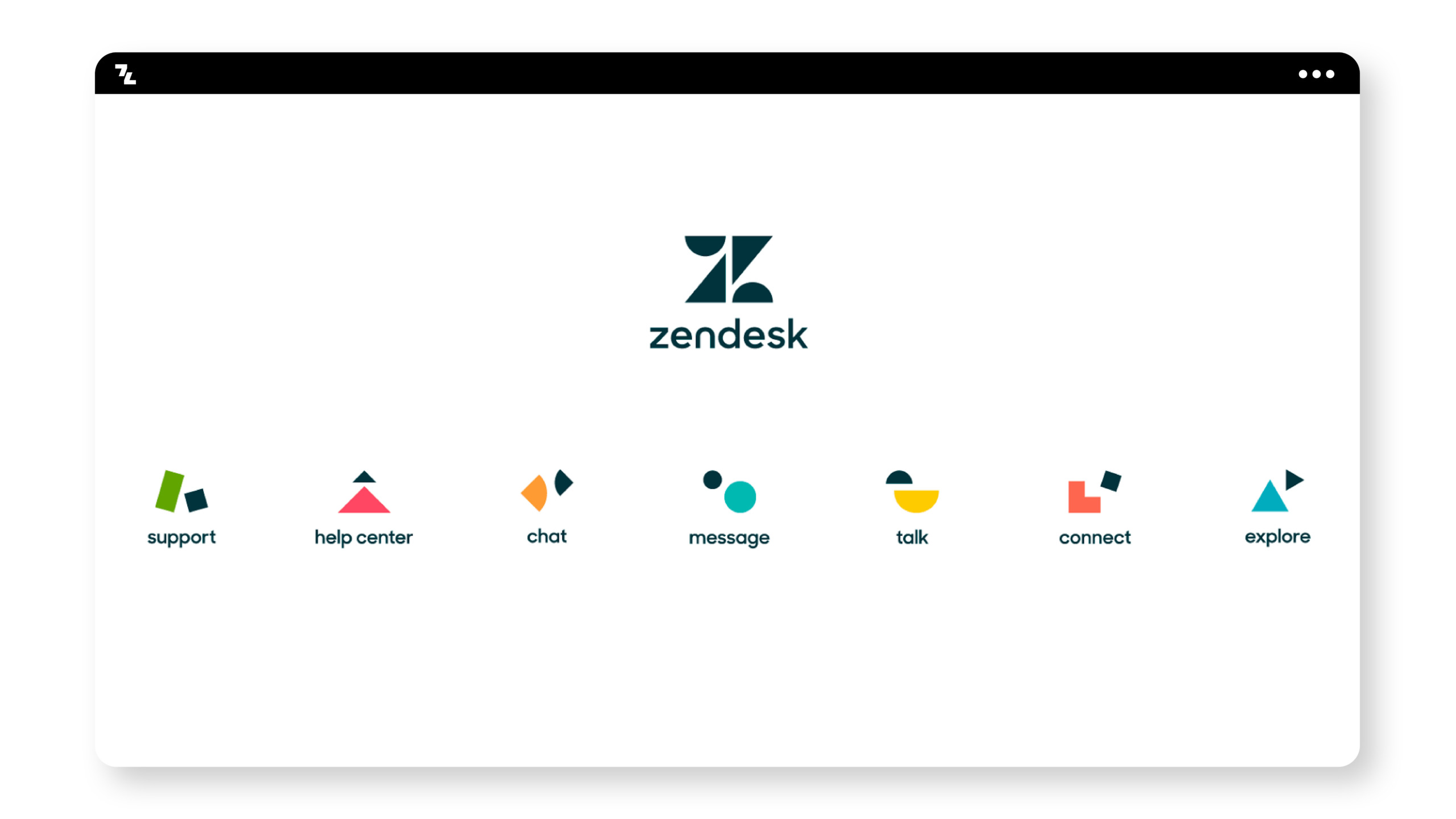
On the surface, Zendesk could be a boring product. They simply provide help desk services. The old Buddha logo was unique and interesting at the time, but it was getting on in years. Reducing the logo to simple shapes makes it instantly recognizable. They also used this look by extending the simple shapes to all their services. Finally, the shapes were brought to life thanks to fun motion graphics.

Do not be afraid of simple shapes. Renowned designer Aaron Draplin has spoken extensively about the importance of designing simply, eliminating superfluous stuff, leaving out fluffy details and sticking to the essential shapes. While there is a place for detail, simplifying designs almost always strengthens them.
Thank you for checking out this list! I have to thank the good folks at BrandNew and Behance for helping me find these examples. I’m sure I’ve overlooked many great brands, and I’d love for you to suggest your favorites. Then I can compile another list of “best” branding and identity examples.
For those of you who are designing, I salute you.
Summary
A corporate identity strategy involves all areas of a company. The goal is to have a positive self-image that then reflects well on others. With a well thought-out corporate identity, you stand out from competitors, convey trustworthiness and strengthen your raison d’être in the market. You also motivate your employees to perform better and save money. Make sure you stick to this identity in all areas of your business to avoid mistakes and alienate customers and employees.


