Key visuals are a particularly important tool in marketing and are an integral part of a wide variety of campaigns, especially for larger companies. In this article, we will explain what a key visual is, what examples are known and how they are created.
Definition
The key visual or keyvisual is a design used in marketing agencies that serves as a guide or visual reference for a campaign. The key visual helps to see what ideas, elements, fonts, and color palettes will be used in all future ads and designs. In addition, the key visual should effectively and clearly express the communication tone and emotions we want to evoke in the target audience.
The key visual shows graphic elements, but it also communicates an identity and tells a “story”. That is why they usually have more dynamics than the logos or other designs. Mostly these are therefore also part of a
Style Guide
.
Here we can appreciate some examples of famous brands.
You are currently viewing a placeholder content from YouTube. To access the actual content, click the button below. Please note that doing so will share data with third-party providers.
More InformationExamples
Below are several examples of successful key visuals from well-known brands that have been seen on various platforms over the past few years.
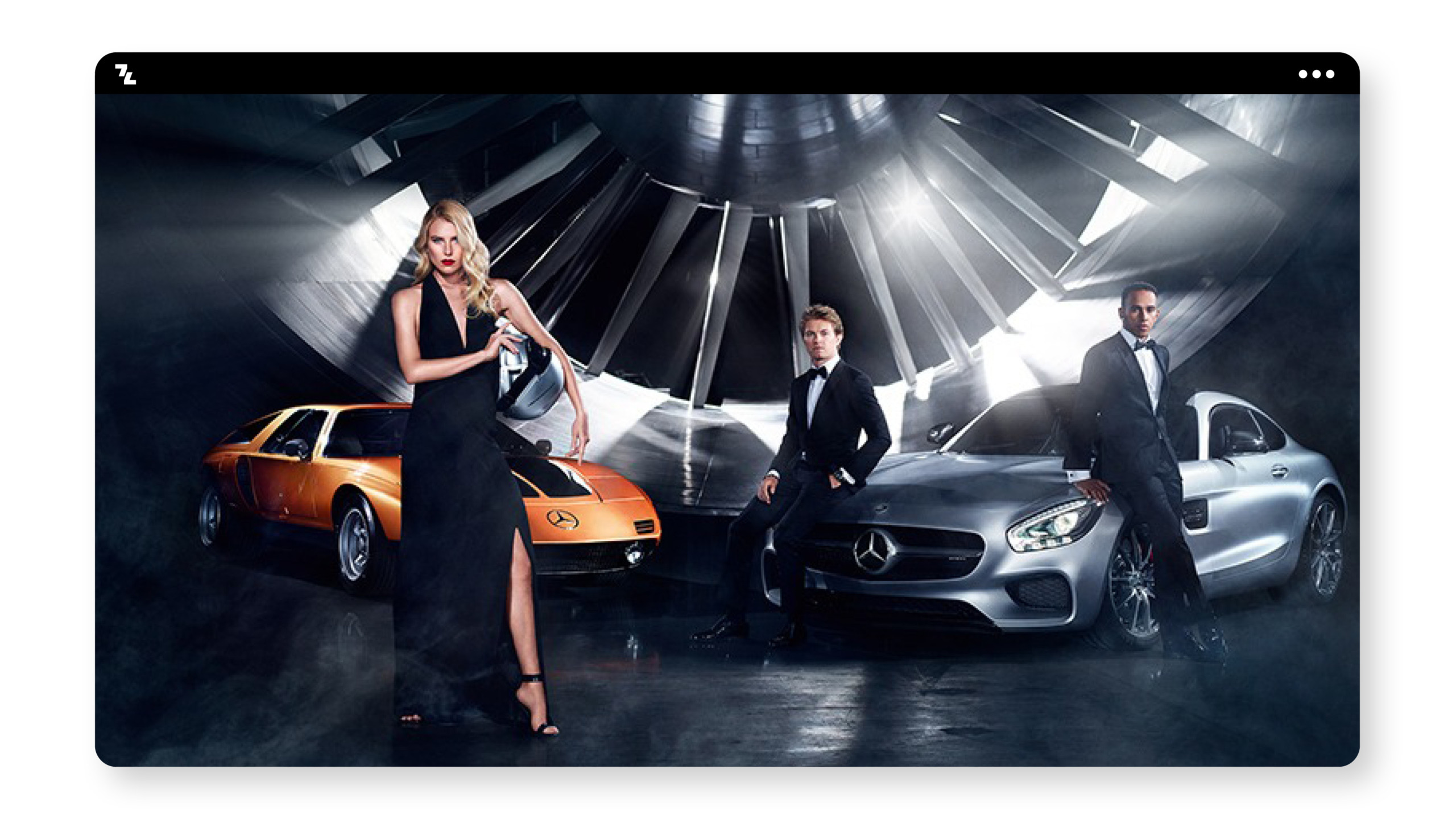
Mercedes Benz
Mercedes presents here expressively that the brand stands for elegance and class. Two men in suit with bow tie and a woman in black evening dress with the top model in the background speak a clear picture.
Milka
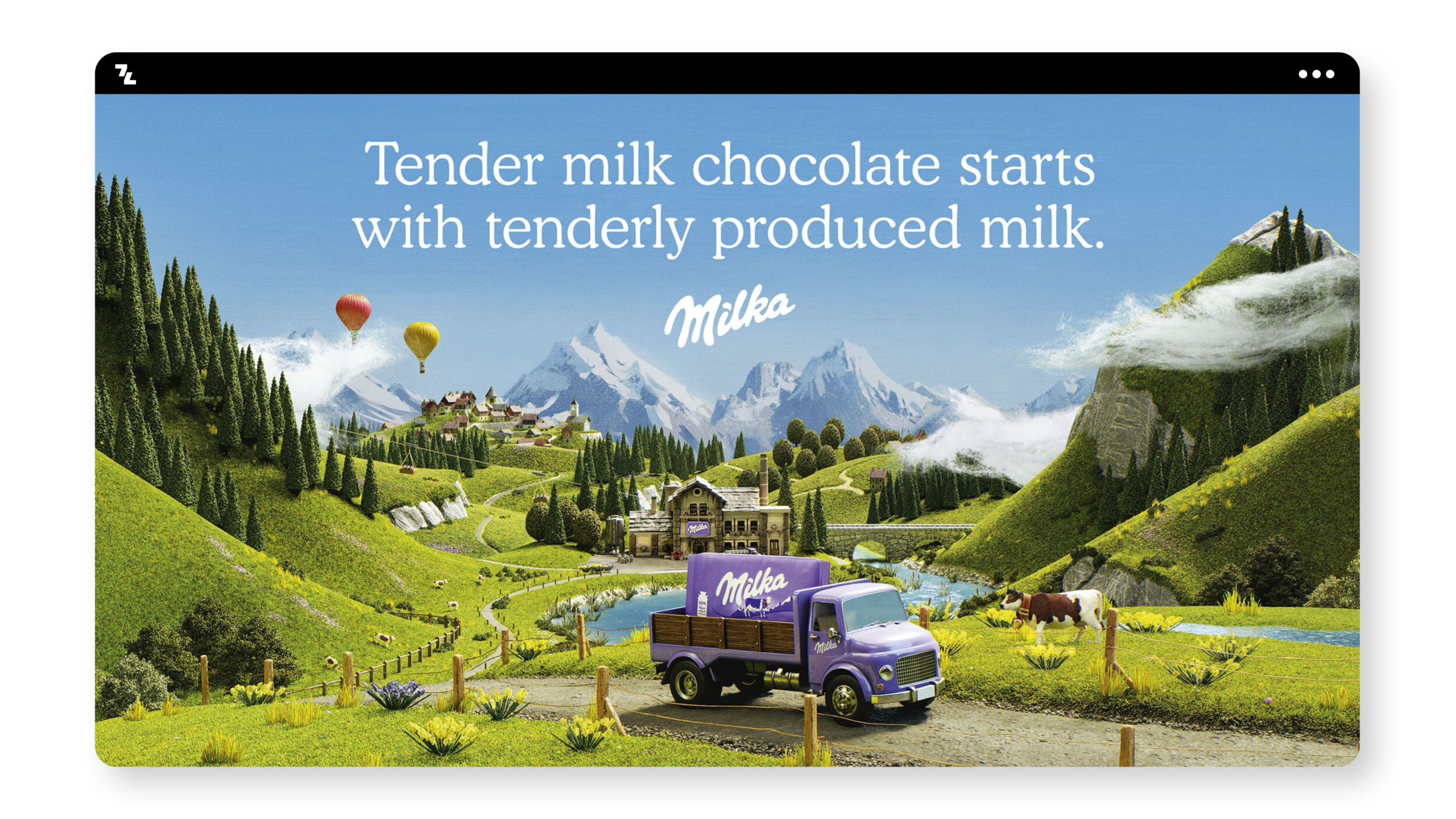
Milka is one of the most famous chocolate manufacturers in the world. The company has understood how to position itself uniquely and how to communicate that. The key visual includes everything that sets Milka apart. The Swiss mountain landscape depicted in the flesh signals the origin and love one has for chocolate making. Therefore
Michelin
Michelin relies heavily on its “visual hammer,” the universally known Michelin male. With strength, conviction and confidence, it throws the tires. Exactly the values for which the tire manufacturer stands.

Duracel
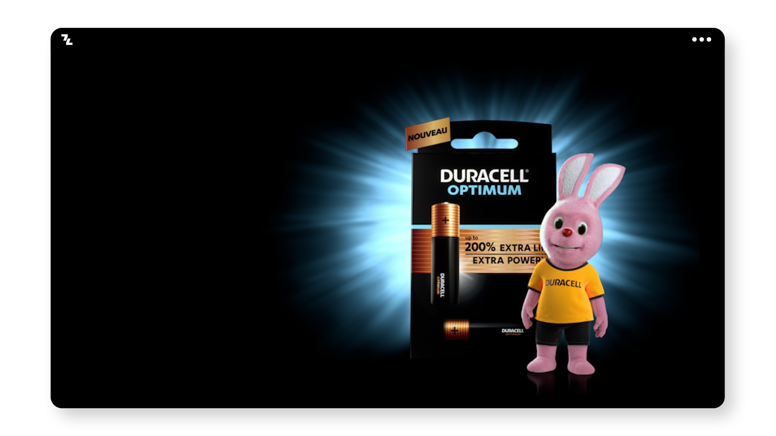
Another interesting “visual hammer” found on the key visual is Duracell’s bunny. Dressed in sports fashion, he can be found ready for the next task, for which he needs a lot of energy.
Jägermeister
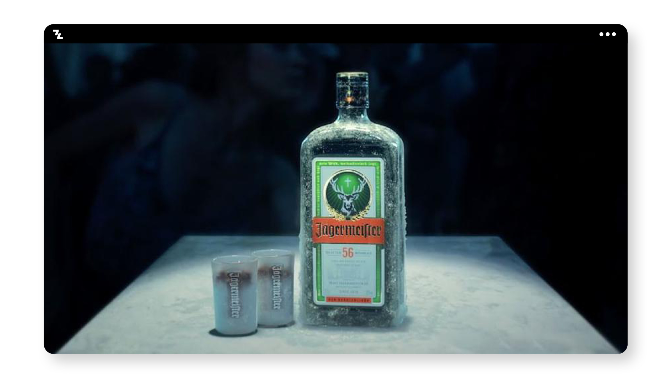
An iconic drink from Germany, which inspires worldwide. Despite difficult pronunciation, you can find Jägermeister in almost every bar spread around the world. The key visual represents the power of the herbs and roots that characterize Jägermeister. The stag in the background supports the dominance, masculinity but also closeness to nature of the drink or brand.
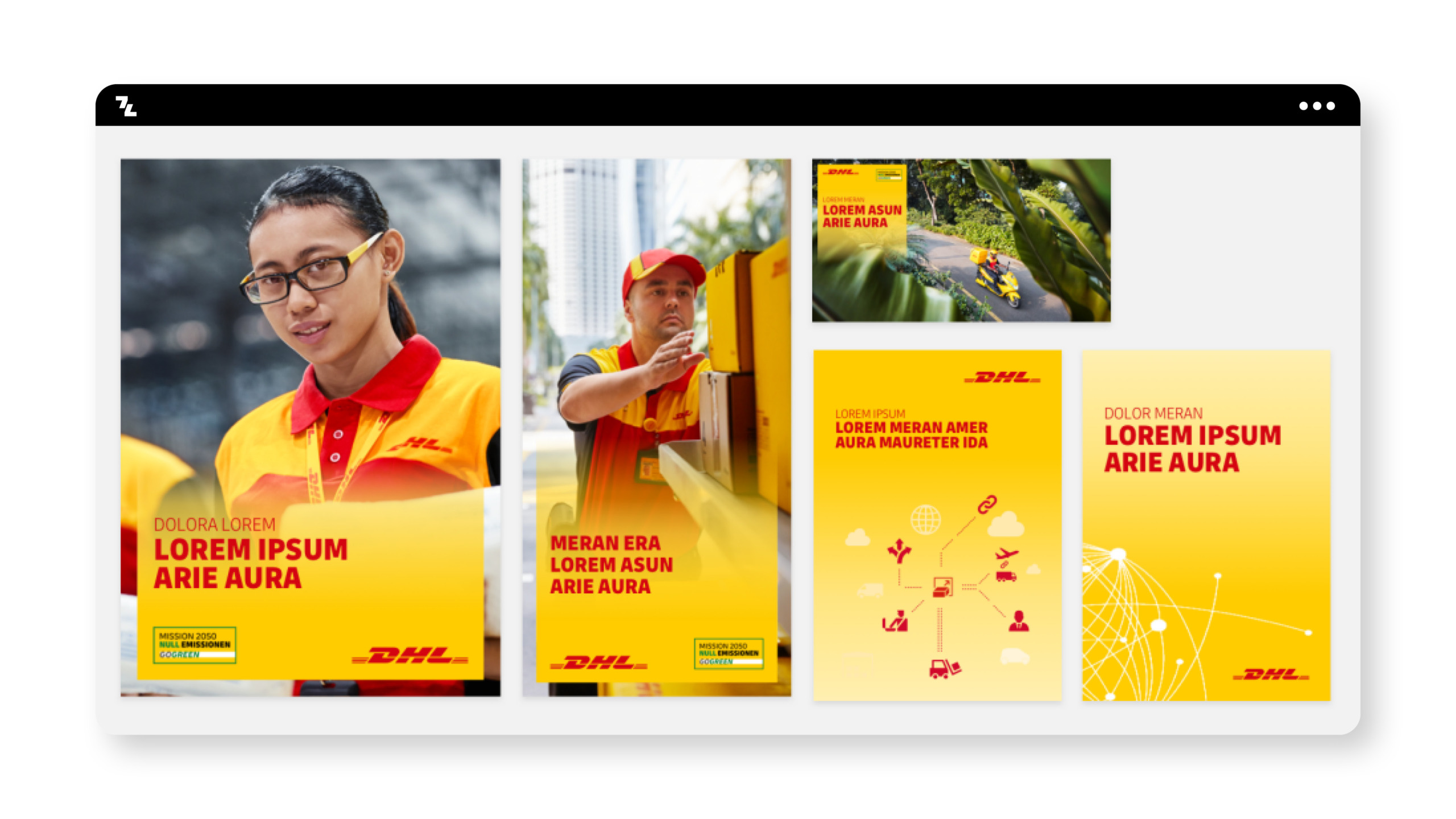
DHL
If it has to go fast, then with DHL. Various key visuals of the logistics company, convey competence, solidarity and effort.
Development
So how does a company come up with a key visual? Basically, this process can take a very long time, because the goal should be to accommodate or communicate the entire values, vision and philosophy in one image.
In any case, a clear and well-founded brand strategy is necessary as a basis for this.
To create an expressive key visual, skills in graphic design, rendering and photography are usually necessary. Most key visuals are a combination of these areas. Ideally, you should commission a professional
branding
agency. As a branding agency from Vienna, with branch offices in Graz and Dubai, we have developed numerous key visuals for our international clients.
