


Project information
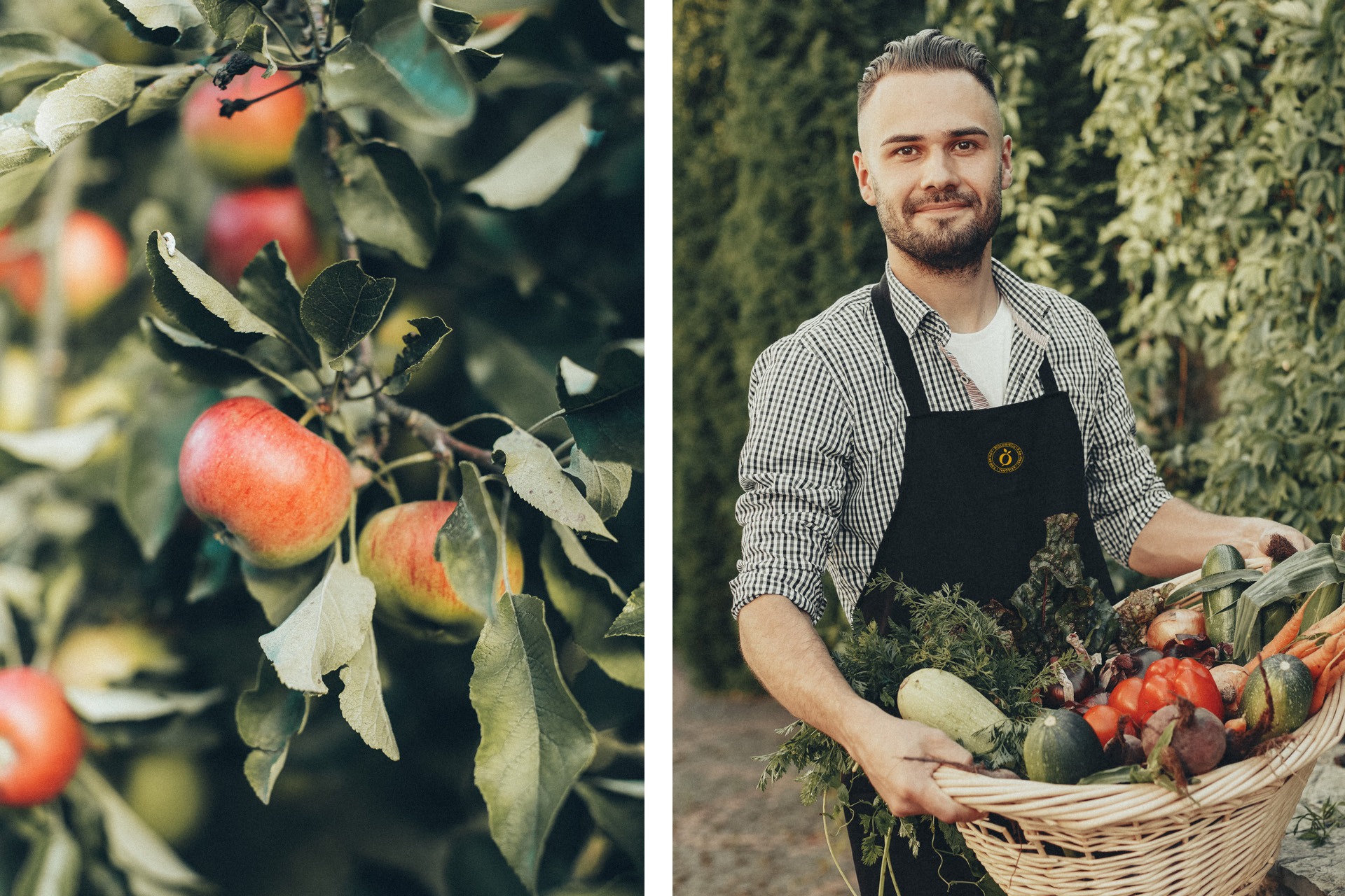
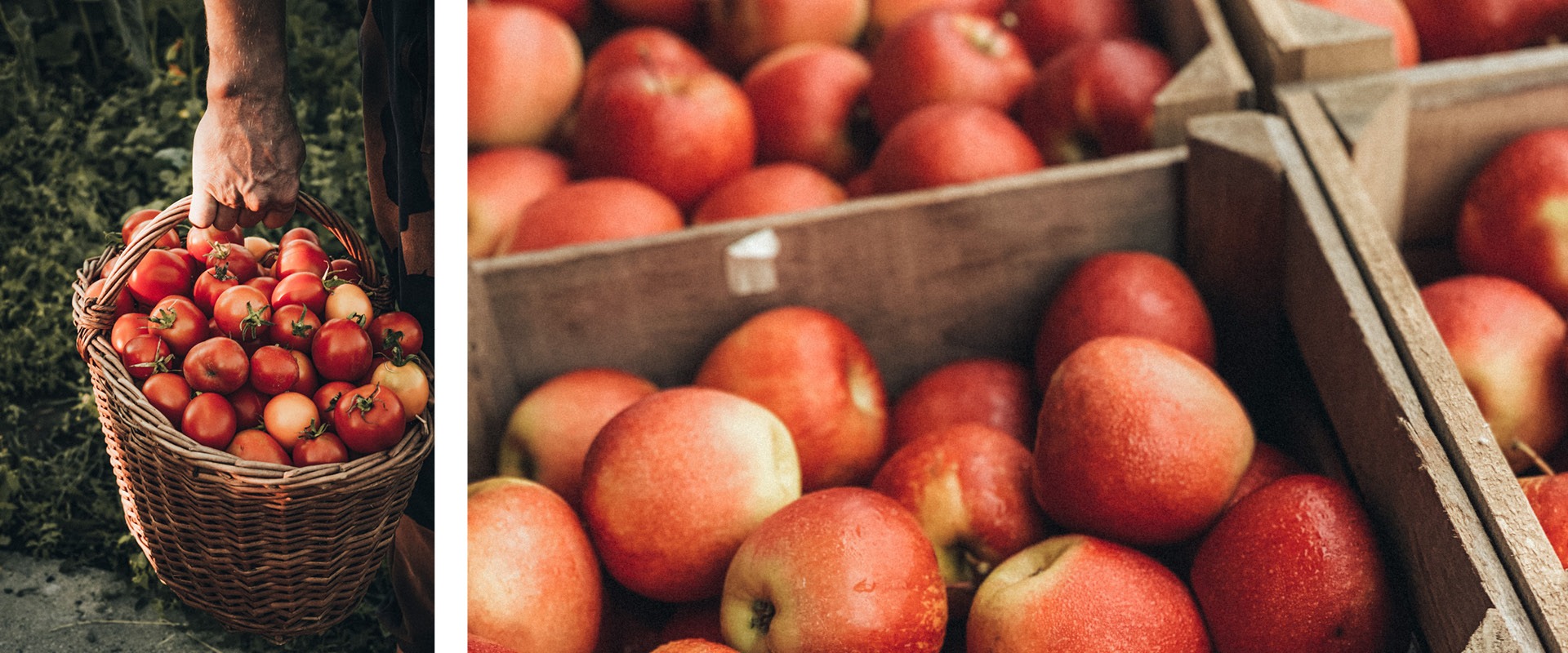
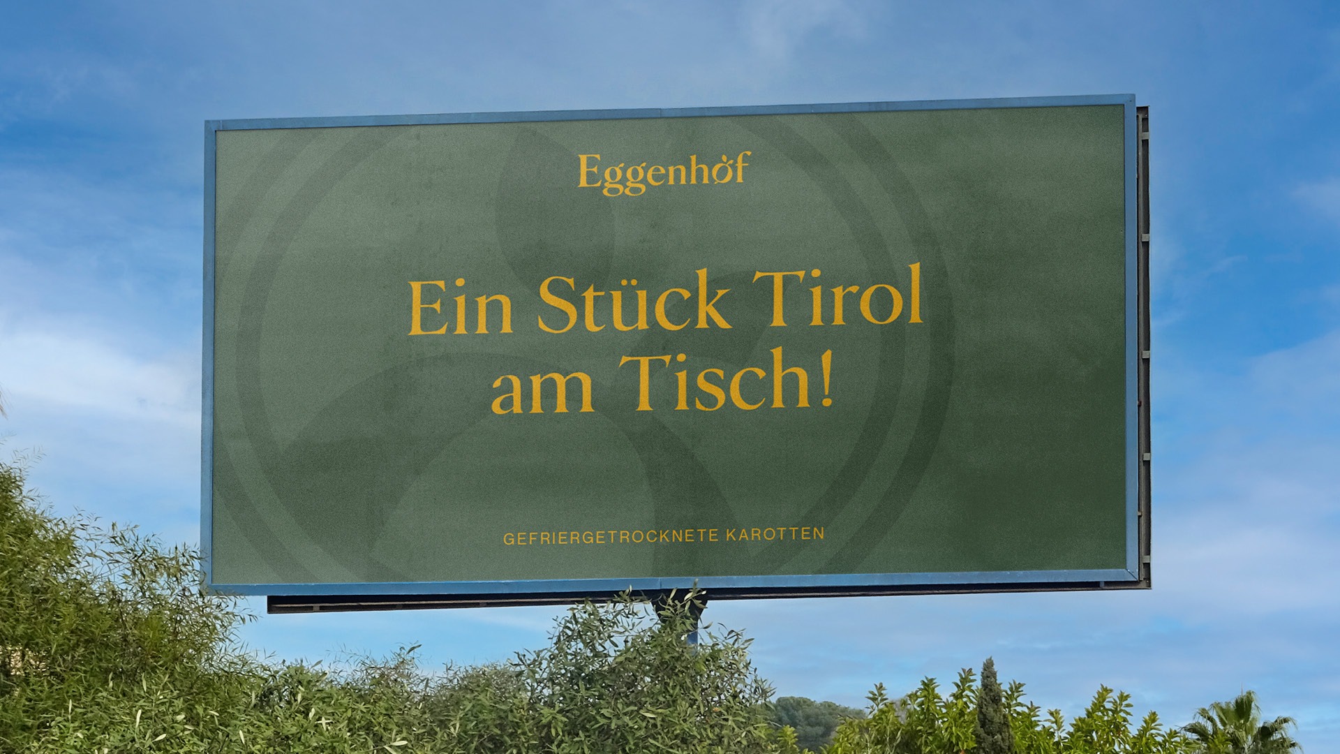
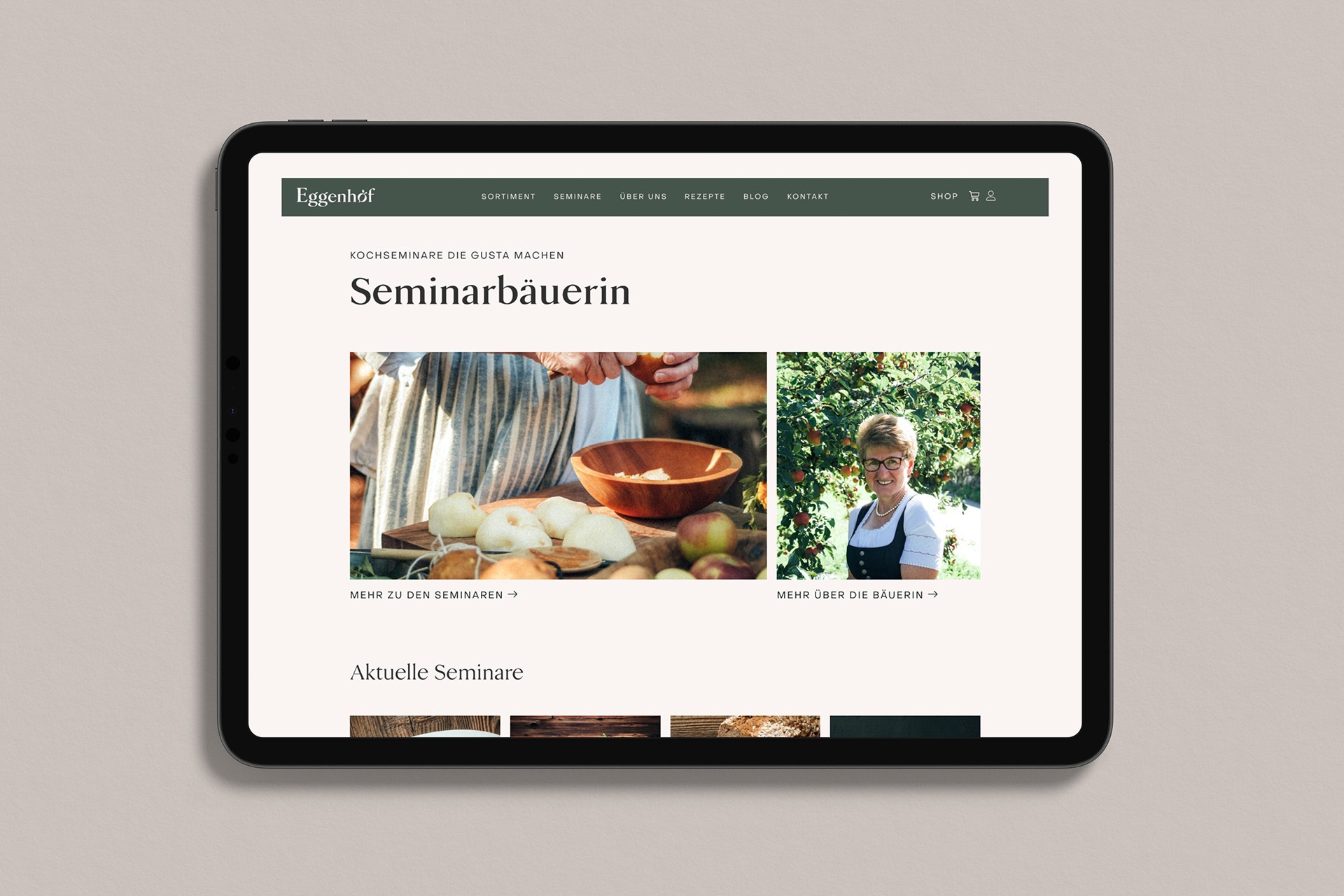
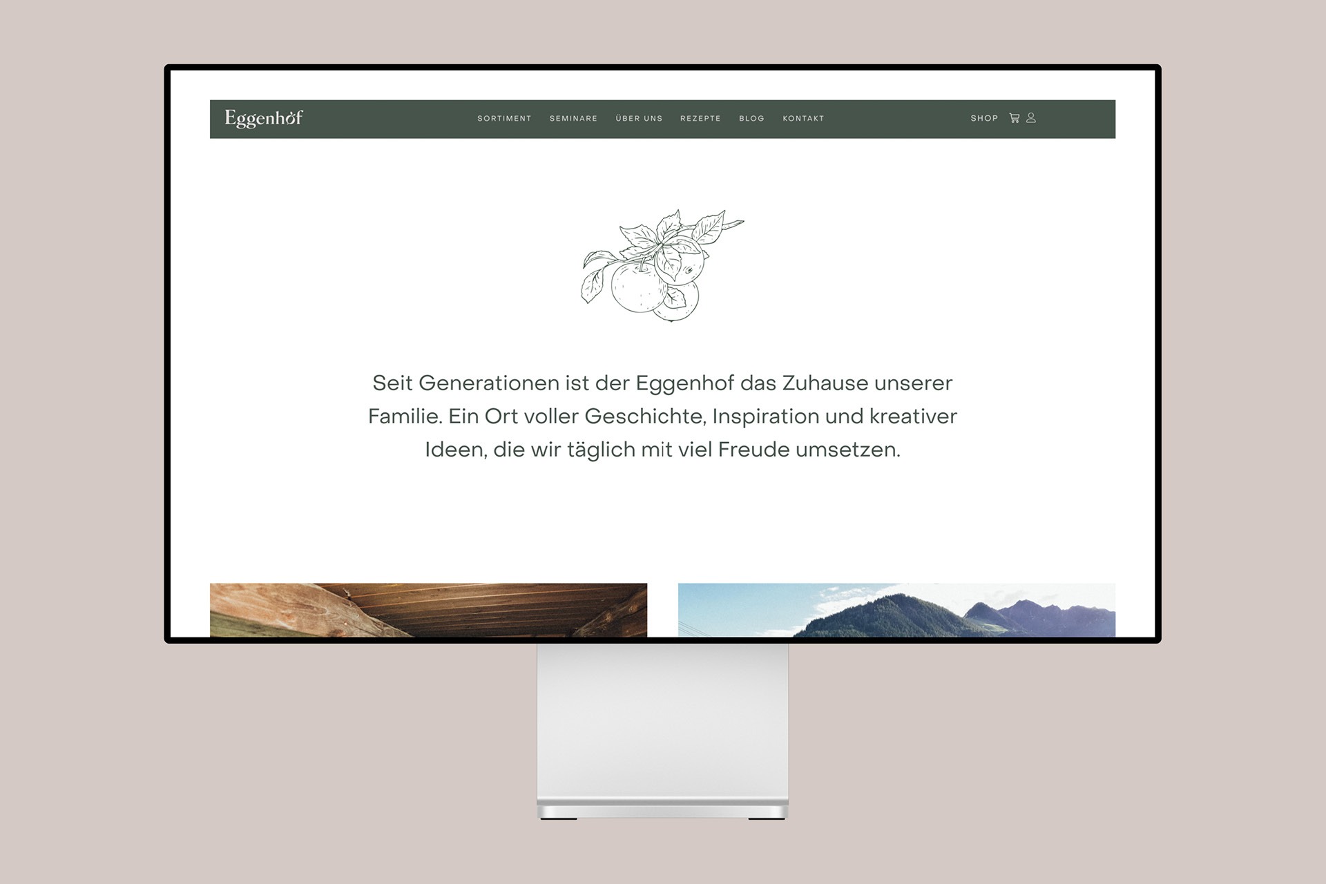
Eggenhof stands for regional reference, high quality food and direct contact with nature. We developed an unmistakable brand identity for this traditional family business and implemented it on an attractively designed website.
Details
Client
Eggenhof
Year
2022
Services
Challenge
The challenge was to filter out the deeply anchored values of Eggenhof and to clarify them in such a way that the appearance appears traditional-tried and modern-fresh in equal measure.

Solution
Through the development of a clear brand strategy and the individual reinterpretation of the corporate design, ways were worked out to clearly emphasize the unique style of the Eggenhof and to prepare it for the target group.
Result
The result: A stylish and lovingly designed online presence, which corresponds exactly to the spirit of the Eggenhof in color, form, texting and message. In this way, the target group can be deliberately addressed and made aware.


How strong is your brand presence?
For non-binding initial consultations – to analyze your potential or concrete project inquiries – we are gladly at your disposal.